Independent Stampin' Up! Demonstrator - Coldwater, Michigan - KatheD@gmail.com
Showing posts with label ATC. Show all posts

Friday, April 5, 2019

April adventures

The U.S. Postal Service officially designated April National Card and Letter Writing Month in 2001 “to raise awareness of the importance and historical significance of card and letter writing.” A month dedicated to cards sounds like it was just made for me, doesn't it?  Sending and receiving cards makes people feel good, and snail mail deserves a more love.  So far this month I've mailed three or four cards, and today is only the 5th!  I'm not going to attempt one every day, it's just worked out that way so far.  I needed one more for a quick note, and the Atlantic Hearts sketch was perfect:
stamp set - Better Together; ink - Grapefruit Grove; card stock - Daffodil Delight, Grapefruit Grove, Granny Apple Green; designer series paper - Botanical Butterfly (Sale-A-Bration, retired); punch - Sprig
 
I'll use it to mail this Artist Trading Card.  I made a set of four but only needed two.  One will go in my own collection and the other is for an April swap with a Greek mythology theme.  A lovely Facebook friend expressed interest in receiving one of the extras - that made my heart happy!

 I hope something makes your heart happy today!

Sunday, May 8, 2016

weekend crafting adventures

I saw this on Facebook Friday - how perfect is that? - SOO me!  And yes, I spent the weekend crafting :)  I warmed up by recreating some cards from Pinterest so I could close some open tabs on my PC.

Then I tackled the Curtain Call challenge, and found inspiration in the flowers and colors:

stamp set - Awesomely Artistic; ink - Perfect Plum, Lost Lagoon, Pear Pizzazz; card stock - Vellum, Lost Lagoon, Whisper White, Pear Pizzazz; Wink of Stella - Gold; Big Shot with Brick Wall embossing folder
I really love how the gold Wink of Stella looks green on the vellum layer over the Lost Lagoon layer of the dragonfly's wings!  I can never decide/remember whether dragonflies are green, or blue, or both, so I think it's just perfect (even if I do say so myself).

Today, I worked on ATCs (also know as Pocket Art Cards) for DLP2016™.  Last week's prompt was to use a color I avoid - which obviously would be pink (bleah):
stamp set - Elements of Style (retired); ink - Blushing Bride; card stock - Naturals White (retired); designer series paper - Fan Fare (retired); 1/2" crochet lace - Venetian (retired); broken earring, heart charm and pre-tied bow from my stash of stuff rescued/saved "because it ought to be good for something someday"

While I had the Blushing Bride (least annoying shade of pink) out, I made a card using Libby's Watercooler sketch:
stamp set - Rose Wonder; ink - Blushing Bride, Versamark; card stock - Whisper White, Tip Top Taupe, Blushing Bride; designer series paper - Go Wild; 1" lace - Tip Top Taupe; Big Shot with Ovals Collection framelits

It ended up totally different than my original ideas, which didn't involve turning the sketch sideways and started with using one of the "wild" designs in the designer series paper stack, but this worked out.  And, none of the components are retired - yet!

Wednesday, March 12, 2014

a WOYWW Jingle Belles Festive Friday adventure

I woke up this morning with the same earache, stuffy/runny nose and scratchy throat that kept me home yesterday.  After I was showered and dressed I realized that I was just sick enough to be miserable and only marginally productive, so I stayed home, reluctantly, again.  I took a photo of my workspace and went to work on the final project for tomorrow's Wacky Watercooler Blog Hop:
It's kind of dominated by ATCs that I've been making; I still need three more.  Finished ones at the far left, stamp at the upper right corner of the pad of grid paper, and the sunburst mask I used for the latest one.  On the grid paper are the ink pads and a mask for that last blog hop project - you can see it here tomorrow at 9pm EDT!  A few leftover Hexagon Hive bits that may be useful eventually, some framelits and printed samples at the far right.  There's a blank canvas and easel that were too small for the project I had in mind, but they'll be used for something someday.  You can also see a canvas in the window - it's one my daughter painted when she was first learning to paint by copying famous artists.  He never got his wings, but he always makes me smile.

After I finished that, I logged on at the computer.  Thinking that a Christmas card project would help me feel better, I checked some challenge blogs - and what to my wondering eyes should appear {heh} but a  card I made last week named as a shooting star at 'Tis the Season!  That totally made me feel better! 

I took it as a "sign" that I needed to use that sweet Jingle Belles sketch one more time for the Festive Friday- inspired gingerbread and holly card that's been bouncing around my brain all week:
stamp sets - Scentsational Season (retired), Christmas messages; ink - Chocolate Chip, Versamark; Stampin' Write marker - Versamark; Stampin' Emboss powder - clear, white; card stock - Cherry Cobbler, Chocolate Chip, Wild Wasabi; designer series paper - Holly Berry Bouquet; 3/4" chevron ribbon - Chery Cobbler; Big Shot with Scentsational Season (retired) and Oval Collection framelits; Stampin' Dimensionals
I'm feeling quite a bit better, now and looking forward to getting back to my other desk and computer tomorrow, but I'll be back here in the evening for the blog hop - please stop by again, won't you?


Sunday, March 9, 2014

another ATC adventure

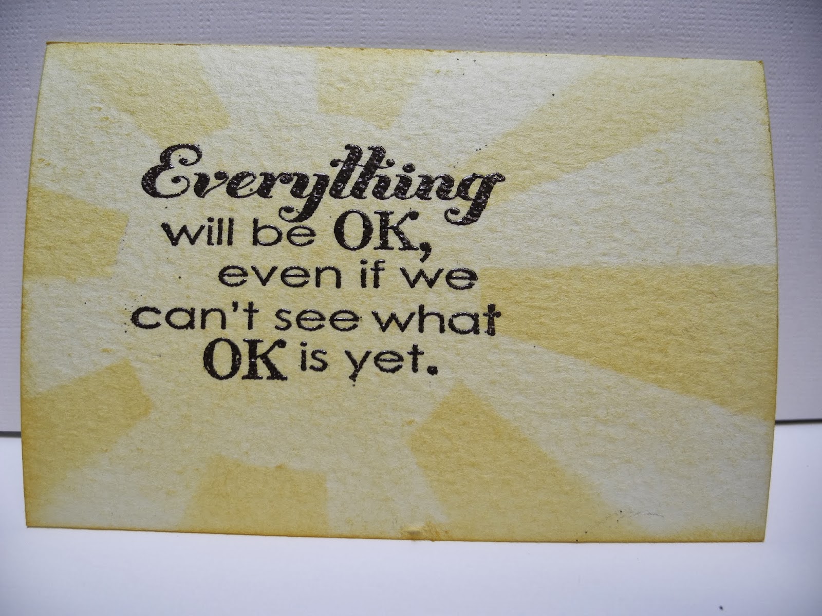
Remember the ATCs I made last week?  I took them with me when my group met last week, then realized that even though not everyone is currently in need of encouragement, it wouldn't really be nice to not have enough for everyone.  I made two more this week, starting with a mask I cut for a sunburst, which just happened to be what Just Add Ink is looking for this week:
stamp set - Really Good Greetings; ink - So Saffron, Versamark; Stampin' Emboss powder - early Espresso; card stock - Watercolor paper; stampin' spritzer, stampin' sponge
Although this one is fairly simple, it took me most of the week - after I designed and cut the mask and made a trip to the house to pick up the rubbing alcohol for the spritzer, I learned why the the design for the mask should not be done in ink...  
 
Meanwhile I was really enjoying imagining sunny skies, so I stayed with that theme for Technique Time Tuesday:
stamp sets - You're Amazing, Really Good Greetings; ink - Tangerine Tango, So Saffron, Black Stazon; card stock - Whisper White; Dazzling Details, miscellaneous tissue paper and acetate
Those teeny little specks are glitter, really, and very hard to photograph, especially under acetate!  I followed Mynette's Caught in Crystal tutorial pretty exactly, but now I'm thinking I should have used only 3 drops of reinker, given the small size of this project.  I've seen this technique explained before, but Mynette makes it look as easy as it is - check it out if you haven't already
 

Monday, March 3, 2014

an ATC adventure

Not long ago, I read an article that asked how do we show that we care - there are different ways to do that, not all of us are the same - I make (and eventually send) cards. I know several people who are going through difficult times lately, and when I listen to them (another way to show caring) I want to be able to reassure them that everything will be OK.  I didn't want to write out cards, though - I still have several thank you notes to write.  After pondering it a bit, I decided to make some Artist Trading Cards, thinking a recipient could keep one in a wallet or purse, add a magnet to display it on the fridge, or add velcro to mount it on a car dashboard.  

I turned to some challenge blogs for color inspiration, and started with Dynamic Duos:
stamp sets - Really Good Greetings, Beautifully Baroque; ink - Rose Red, Midnight Muse; card stock - Very Vanilla, Watercolor paper; Big Shot with Chalk Talk framelit; Stampin' Spritzers, sponge dauber

 I tried Less is More next.  I think this is a clean and simple design, but I don't work in the small ATC size often, so it may not have enough "white space"?
stamp set - Really Good Greetings; ink - Garden Green, So Saffron; card stock - So Saffron, Watercolor paper; Big Shot with Apothecary Accents framelit, Stampin' Sponges, Stampin' Spritzers

I decorated the back with flowers, so I needed something less feminine, and decided to work with the combination at Colour Me...!:
stamp sets - Really Good Greetings, Truly Grateful, Hardwood; ink - Basic Black, Versamark, Smoky Slate, Real Red; card stock - Bermuda Bay, Smoky Slate, Real Red

One of the women I want to give a card has a son who's struggling; I wanted one more masculine card in case she'd like to share hers with him, and the colors (and photo!) at Color Throwdown were perfect:
stamp sets - Really Good Greetings, Gorgeous Grunge; ink - Versamark, So Saffron, Tangerine Tango; card stock - Watercolor paper; Stampin' Emboss powder - Black; punch - 1-3/4" circle; Stampin' Sponges

Whoo - my white balance is way off on the last photo, and it sure washed out the So Saffron sun - guess I better look at that tonight!

Tuesday, September 13, 2011

ATC adventure

This didn't turn out nearly as elegant as it was in my imagination, but I had a go at adding an ATC element for DECK the Halls (week 37) at Jingle Belles, where the instructions were "any or all of the following:

make a freestanding (2.5 x 3.5") xmas-themed Artist Trading Card
OR
add an ATC-sized element to your holiday card
OR
incorporate a playing card into your design
OR
use a recycled xmas card (or an element from
one!) on your (newly made) holiday card!"
I've made ATCs before and I usually like them, but this one seems a little bland to me, in spite of the Iridescent Ice embossing powder on the Tree Trimmings stamp.  And, looking at the photo, I think I should have the sentiment at the top and the ornament closer to the bottom of the ATC element.

I may try it again.  If you want to try something like it, you could replace the retired Deck the Halls (well at least that unexpectedly fits the theme well) designer series paper with a background stamped using the Music Notes Stampin' Around wheel.  I debossed (because I put it in upside down) Textured Very Vanilla card stock with the Textured Impressions Designer Frames embossing folder, punched out the center with the extra-large oval and mounted it on Stampin' Dimensionals above the Always Artichoke/Iridescent Ice embossed Tree Trimmings stamped on River Rock card stock.  Another extra-large oval punched from River Rock card stock is stamped with the sentiment from Bells & Boughs, also in Always Artichoke.  I sponged River Rock ink around all the edges, because somewhere recently (possibly on our Llama Blog Hop?) I read a tip that sponging all the elements with one color will tie them all together.  It does look better sponged than it did without.  I recommend doing the sponging before the elements are glued on, and you can probably guess how I thought of that helpful tidbit...