Independent Stampin' Up! Demonstrator - Coldwater, Michigan - KatheD@gmail.com

Friday, February 16, 2018

adventure with bits & bobs

I was thinking about the box o' bits & bobs because that leftover green tag/mat was being relegated the other day.  The yellowish and coral flower below has been cycling back and forth for about a week between the pile o' bits & bobs (that need to be filed into the box), and the inside of the stamp set case, because I thought that would remind me to use it.  Fortunately, I saw the Spring Wreath challenge at Fusion Card Challenge; I think it fits perfectly with both the photo and the sketch:
stamp set - Amazing You; ink - Old Olive, Calypso Coral, Basic Black Archival; Stampin' Blends - Calypso Coral, Daffodil Delight; card stock - Peekaboo Peach, Basic Black, Calypso Coral, Whisper White; designer series paper - Wood Textures; Big Shot with Simple Stripes Textured Impressions™ embossing folder

Looking at the photo, now, I wish I'd left a margin on the single flower or cut off the margin on the flower with greenery.  Even so, I'm excited about being able to combine both the sketch and the inspiration of the flowers and greenery, the wood, the colors, the inset stripes - I think this is the first time I've ever been able to combine both :)  

Thursday, February 15, 2018

adventure with retro circles

Before I could fall asleep the other night, I spent some more time thinking about all the pretty paper that takes up too much room in my storage drawers.  I was also thinking about the Retro Rubber Dotty For You challenge.  One of the new papers I used the other day would have been perfect, except that I hadn't used an older stamp, which is the main premise for Retro Rubber.  I remembered some older paper that would be even more perfect - circles AND dots! - so I decided to dig it out and sort through the older stamps, as well.  After I found a sketch at Try Stampin' On Tuesday, with the option of polka dots (!), this happened:
stamp set - Sincere Salutations (retired); ink - Old Olive; card stock - Old Olive; designer series paper - Sweet Pea (retired)

Sincere Salutations is the first stamp set I ever bought from Stampin' Up!®; they don't print dates on the sets any more, but this one is dated 2005.

While rooting around in the bottom of my oldest drawer of retired designer series paper, I pulled out some more pieces and made these, too:
stamp set - Sincere Salutations (retired); ink - Old Olive, Stampin' Write marker - Old Olive; card stock - Old Olive, Sahara Sand; designer series paper - Sweet Pea (retired)

stamp set - Teeny Tiny Wishes; ink - Versamark; stampin' emboss powder - Gold; card stock - Basic Black, Pumpkin Pie; designer series paper - Island Oasis (retired); Big Shot with Scalloped Oval Frame Bigz™ die

The last card is CASE'd from Kay Kalthoff, which I only know because there was a watermark on the printout in my samples binder - it was dated 2010.

I didn't make a very big dent in my over-stash of designer series paper, but at least I made an effort!  I also got a little bit ahead on my #365card2018 for #365somethings20118.  Here are cards 44 through 51:

Wednesday, February 14, 2018

an all-day adventure

I started out thinking I would make a quick card with a NeverBeforeUsedStamp set (it has been out on the counter for a couple of months), the CAS Colours & Sketches sketch, and the just-posted-today Color Throwdown challenge.  I completely mis-stamped the background image on the white card base, and while I was trying to decide whether to add a slightly smaller layer of white, I smudged ink at the very edge.  Since that meant the layer was going to have to be full-card size, white didn't seem like the right choice.  I badly mis-stamped the background image twice more, so one of the gray layers ended up in the recycle bin.  When the edge of the stamp made an appearance on the fourth try, it became a design element.  The tag element that I prepared first was too large, and not really lavender.  I found a better choice for the tag image and a better choice for lavender, and eventually I found a sentiment I thought would work, so I finally got this:
stamp sets - Rose Wonder, Background Bits (hostess); ink - Smoky Slate; Stampin' Write markers - Wisteria Wonder, Pear Pizzazz; card stock - Whisper White, Wisteria Wonder, Smoky Slate; Big Shot with Lots of Labels framelits

At that point (after a lunch break), I wanted to use the tag I'd stamped earlier, so I made a green mat for it and went searching for a sketch or something to use it with.  I remembered that the main color was included in the Fab Friday challenge that closes tomorrow, but since green was not one of the colors, I made a new mat.  I didn't find a new sketch, and was running low on both patience and time, so the layout probably looks familiar:
stamp sets - Tranquil Tulips (hostess), You're Inspiring; ink - Sweet Sugarplum, Pear Pizzazz, Powder Pink (on envelope only); card stock - Whisper White, Melon Mambo, Powder Pink; Big Shot with Lots of Labels framelits

If you've been keeping score, you know that there is still a green tag/mat loose on my desk.  It is probably going to be relegated to the big box o' bits n' bobs, because I've pretty much had enough of this adventure today; there are new ideas chasing each other around inside my head, and I haven't yet checked off my daily to-do list, so it isn't going to be a priority.


Tuesday, February 13, 2018

adventures with pretty paper

Like many paper crafters, I have a problem with pretty paper - there's so much of it, and it's so pretty, and I always end up owning more of it than I can use.  It's not that I don't use it, (well, ok, there is some I can't bring myself to use), but I can't seem to use it up.  I bought only one package from the current catalogs, the Wood Textures (my brother and I live in log homes, my daughter used log slices in her wedding decor; I *had* to have it).  But then a second package arrived as an incentive prize from my upline, and a third package was free with an order, and there was another incentive prize this weekend, and now there's a  fourth package in my storage drawer!  It's not my fault, really ;)

Since the newest prompt at Stampin' Up Only Challenges is to CASE a catalog project, it seemed like a really good idea to use some of that brand new paper, so I turned to page 4 in the Occasions catalog, where I found two great ideas:
stamp set - Birthday Wit; ink - Bermuda Bay, Berry Burst; card stock - Lemon Lime Twist, Peekaboo Peach, Bermuda Bay; designer series paper - Picture Perfect Party; Big Shot with Simple Stripes Textured Impressions™ embossing folder

I don't have the coordinating stamp set or the paper ribbon, so I made a few minor changes.  The candles on this card make it perfect for the optional topping at Seize the Birthday, but that challenge closed earlier today (not midnight tonight as I mistakenly thought).  It's a fun card, though, and since the usual theme at Seize the Birthday is Anything Goes, maybe one of these weeks I'll remember to link up while a challenge is still active!

stamp set - Amazing You (Sale-A-Bration); ink - Berry Burst; card stock - Whisper White, Peekaboo Peach; designer series paper - Picture Perfect Party

Monday, February 12, 2018

current challenge adventures

If you've been following along, you will have noticed that I've had some "issues" with the cards I've posted recently.  My theory is that it's because I've been pushing myself a bit to keep up with the challenges I've accepted.  I'm grateful today that I'm current on all of them!  Here are cards 37 through 43, five of which went together without issue:
I'm hoping you noticed the Christmas card in the back row center - here it is again, as part of Twofer Card Challenge #2, where the prompt is Hearts:
Of course, I've convinced myself that I was particularly clever in using not just the EXACT same die for both hearts, but actually it's just one heart; I've used both the die cut and the negative from one pass through my Big Shot ;)  

The Christmas card was inspired by the Jingle Belles' prompt of A-Coloring We Will Go.  I colored the bird last month, and cut him out as well, but couldn't decide what to do with him.  When the new Twofer Challenge posted, I searched Christmas, Cardinal and Heart on Pinterest and found this felt ornament - wow!  Unfortunately the link no longer works, but it gave me the inspiration I needed.  I was still dealing with issues, though.  I attempted to cut the heart through the front of a card base - it was both crooked and off-center, necessitating some serious trimming.  Then I was a little rough with the bird and broke off the leg on the right - it's been mended, but doesn't he look a bit spraddle-legged?  Maybe it's just me...
stamp sets - Best Birds, Christmas Pines; ink - Memento Tuxedo Black, Smoky Slate; Stampin' Blends; Stampin' Write marker - Basic Black; card stock - Whisper White, Soft Sky, Smoky Slate; Big Shot with Sweet & Sassy framelits and Woodland textured impression folder

And, making use of a NBUS stamp set that has so many options I temporarily had a bit of creativity paralysis, the companion card, a bit more Clean And Simple:
stamp set - Waterfront; ink - Marina Mist, Soft Sky, Peekaboo Peach, Fresh Fig, Always Artichoke; Big Shot with Sweet & Sassy framelit

Friday, February 9, 2018

musical masculine adventure

When I think of masculine cards or designs, I think first of clean and simple.  So, when I saw the music prompts at Less is More and at Cardz 4 Guyz, I immediately thought they were meant to be combined:
stamp sets - Sheet Music, Birthday Wit; ink - Basic Black Archival, Dapper Denim; card stock - Soft Sky, Dapper Denim

It didn't take me long to make the connection between the two challenges, or even to decide what to do with it, but it's been in the works for a few days.  After I decided on a layout, I mis-stamped the designer series paper - if I had done what I intended, the card would be landscape.  It was fairly late in the evening and I was a bit tired, so I left it on my desk overnight.  The next morning (yesterday), I was more than just a bit tired, I felt really run down the whole day.  It was still sitting on my desk this morning, and I had forgotten it was there.  Fortunately, I'm feeling more myself today, and have it finished at the last minute for the Less is More challenge, which is for their birthday!

Monday, February 5, 2018

nearly not an adventure

This card, which uses the Try Stampin' On Tuesday sketch which ends tonight and the Jingle Belles Text me prompt, did not really want to be completed and posted:
stamp sets - Christmas Punch (hostess, retired), Cozy Christmas (on envelope); ink - Soft Suede, Chocolate Chip (on envelops); card stock - Copper Foil, Old Olive, Early Espresso; designer series paper - Letters To Santa (retired); punch - Curly Label (retired, not sure I got the name right); metallic sequins

It took me days to decide what I would do and then find the text-y paper at the bottom of my box o' Christmas papers.  The Early Espresso ink pad that should match the paper was too dry; after I applied reinker, it was too dark.  The same thing happened with the slightly lighter ink, Chocolate Chip.  My fifth attempt at stamping, with Soft Suede, is the sentiment I used.  It seemed to need a mat, but it didn't look right when I glued it on white, so I disassembled it and tried copper, to match the sequins.  The sequins were about the only thing that went right,since the optional prompt (which I had forgotten) at Try Stampin' on Tuesday was metallic!  Finally, when it was done, I opened it to add a sentiment and found it was upside down.  I trimmed up the original Old Olive base and applied it to an Early Espresso base.  sigh.  

Meanwhile, over at the computer, the Internet connection disappeared.  It's working everywhere else in the house, including the laptop on which I'm typing this, but I don't have a good working relationship with this keyboard, so there's no guarantee that you see what I think I'm saying.  

Now that the card is actually complete, it is number 36 or my #365cards2018.  Here are cards 30 through 36 for #365somethings2018:

Sunday, February 4, 2018

new product adventures


OK, I know you've seen these products before, including here (assuming you've been here before) but my Stampin' Blends and Brusho Colour Crystals are still new enough to me that I feel I need a lot more practice.  I loved 
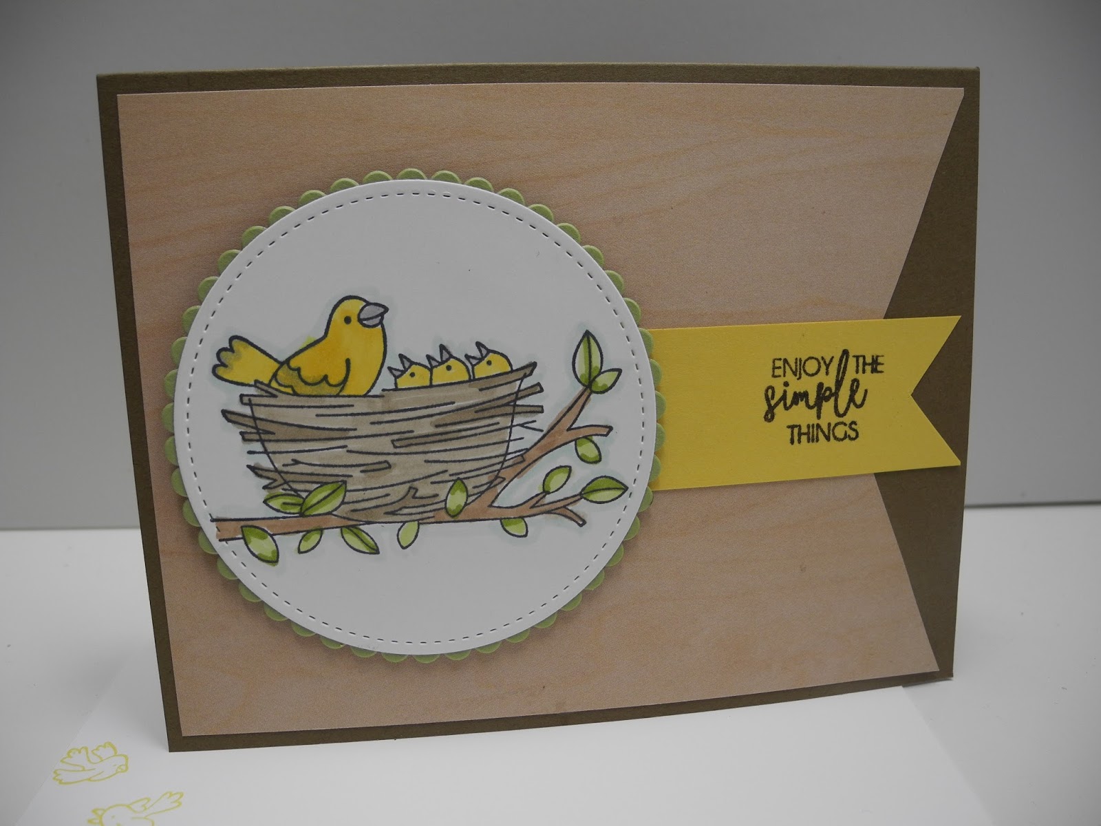
this card of Amy O'Neill's, but couldn't bring myself to make any more blue cards; for some reason, half of the cards I've made and added to my display stand recently have been mainly blue!  I changed the colors and also changed the layout a bit, using the new one from Sketch Saturday:
stamp sets - Flying Home, Yay You (hostess); ink - Memento Tuxedo Black; Soft Suede; Stampin' Blends; card stock - Whisper White, Pear Pizzazz, Daffodil Delight, Soft Suede; designer series paper - Wood Textures; Big Shot with Stitched Circles and Layering Circles framelits  

Looking at it now in the photograph, it seems like it just needs a little something more - maybe a spray of leaves tucked under the right side of the circles?  I'll try that...

Before I go, though, I also wanted to share this card, which I made with my favorite color of purple for Tuesday Throwdown:
stamp sets - Beautiful Day, Yay You (hostess); ink - Memento Tuxedo Black, Versamark, Melon Mambo; stampin' emboss powder - Clear (I think, maybe White?); Brusho Crystal Colours - Brilliant Red, Prussian Blue; card stock - Watercolor, Very Vanilla, Dapper Denim, Perfect Plum  

I'm pretty pleased with it, other than having inadvertently shortened the butterfly's body.  The Stampin' Up! set of Brushos doesn't include purple (whaaaat!?), so I mixed my own by combining blue and red crystals on a palette and mixing them together with water.  I used an Aquabrush to painting the watercolor onto the butterfly, which is stamped and embossed on watercolor paper.  I used the same two colors for the background by simply sprinkling them onto dry Very Vanilla card stock and spraying water at an angle across them.  I've found that I can use the less expensive plain card stock without an issue if I don't try to "work" the colors.  The red spread and lightened more than the blue, so to give it more definition, I stamped the flower image over it using stamped-off Melon Mambo.